Branding
Nicola - China Edition
The goals of this academic work were to make a new range of a product for a brand of the student's choice.
Having chosen the brand Nicola, and after properly researching it, I found that it is looking to expand in the Food Service and Mass Market industries.
With a variety of lineups and high-quality products, such as the tea and infusion lineups, and the Alma coffee lineup, Nicola brings to it's consumers exotic flavors and an elevated experience.
For this work, I brought these ideas together and created a lineup of Chinese tea: Nicola - China Edition.
In the initial tests, I already knew that I wanted to use a traditional Chinese illustration and use calligraphic typography to focus on the Chinese ink spot.
After further testing, I decided to focus the branding on the illustration of a traditional temple in a mountain and to use the texture of traditional Asian paper. After multiple experiments, this is the final solution for my work.
Galeria Municipal de Arte
This academic work's objectives were to achieve an effective visual identity, by identifying the needs of a company or institution in terms of change in it's public image and visual communication, and to create and develop an intervention program to apply.
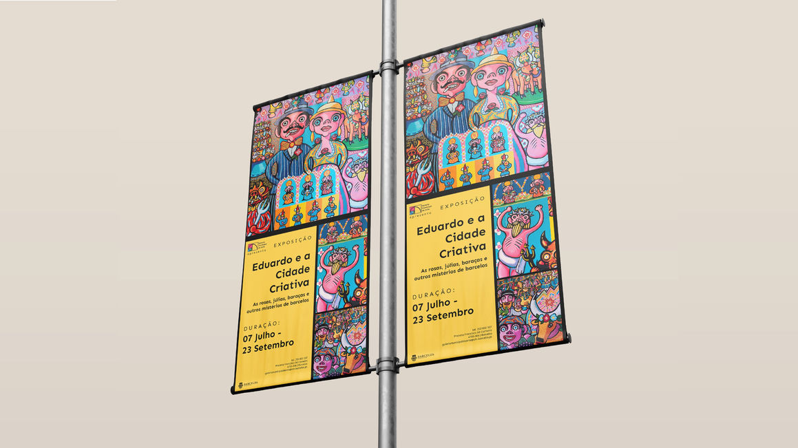
Galeria Municipal de Arte of Barcelos promotes art in it's various forms in a space dedicated to reflection and cultural appreciation through the organization of various exhibitions, which include works of painting, sculpture and photography by local and national artists, aiming to stimulate this space in order to encourage participation of citizens in cultural acts.
The golden ratio was chosen to represent this brand because of it's involvment with the arts since Ancient Greece, as well as it's involvment in the nature of growth.
The golden ratio can be found in men, in hives, in flowers and among countless other examples that involve the natural order of growth in nature.
This growth order is a fundamental value that is behind the new image of Galeria Municipal de Arte, showing explicitly and implicitly that the institute is following the changes in times and expanding cultural knowledge in the same order.
Dia D: identity of an event
This academic work aimed to develop an effective communication program for a real school and regional-wide event. In addition, the specifics of the various forms and means of communication available were also required: poster, leaflet, flyer, website and signage.
April Greiman's boldness of colors and patterns in the New Wave era and Josef Muller's graphic universality are two opposite extremes. But how would the fusion of these styles be? In search of graphic solutions out of the ordinary, me and another colleage took this challenge with ambition, creating a new modern expression with retro elements.
Posters in History
After an extensive study on the history of posters, which went through several important movements that influenced graphic design, this academic work asked us to choose an artist / designer that interested us, and use their style to create our own original poster of an event of our choice.
I chose the pioneer designer April Greiman as my artist and the Porto Pride Parade as my event.
The objectives of this project were: to know the specifics of the means of communication; to know what is a poster - it's history, technology and current reality; to recognize image criteria and values such as iconicity, abstraction, complexity, simplicity, normativity, universality, historicity, aesthetic or connotative charge, fascination; to know how to develop an analytical study of form and function in particular cases; to understand the concept of appropriation in visual culture; to develop notions of graphic composition such as position, shape, orientation, color, texture, value, size; to consolidate notions of typography and visual message; to identify technical aspects of industrial production.


